Article Archive
Luc Nagel
"Ian Anderson, founder of The Designers Republic, says the concept is based on ideas suggested by James in early discussions about the album's packaging. “At the beginning of the process we discussed a few ideas Richard wanted to explore – one was the idea of pressing the album or a single track into the fabric of the cover, effectively as a deboss; a second was to use shots of the raw vinyl pucks albums are pressed from; and the third was to document in some way every cost involved in the production of the specific album format the purchaser had in their hands,” he explains."
- "Warp releases Syro artwork by The Designers Republic" Rachael Steven. creativereview.co.uk, 2 September 2014. Web. 4 September 2014.
"I was happy to be able to work on something that Torsten had done for Honest Jon's. I remember he used to do this thing called Traktor, and I bought it in FatCat, and it was just so intriguing. Like, what is this record from Berlin? My God, it sounds insane, it's got this obscure graphic. As a fiend for this stuff, I get excited to go to a record shop and say, "What is that? It looks weird." That's my main goal really. People always ask me what designers I like, but really it's those things that aren't designed that I like. To be honest…well…I look back at sleeves that I did last week, and I don't like them really. With Actress, for example, though he told me he was into geometric shapes. That was a really nice brief to work with. I was pleased with how that turned out. "
- "Under the covers: Will Bankhead" Will Bankhead. residentadvisor.com, 15 September 2011. Web. 4 September 2014.
"Perhaps he’s wary because the iconography of the band came to transcend the music. Flea, the Red Hot Chili Peppers bassist has said: “Before I knew what Black Flag was I remember walking around Hollywood and seeing Raymond’s flyers and being like, ‘What the fuck is that?’… Those flyers made me feel like something is going on and it’s romantic and it’s mysterious and it’s heavy and I don’t know what it is but I wanna know.” My favourite flyer is the one he made in response to frontman Henry Rollins’s request for a “fuck you” middle finger for the release of 1981 single My Rules. It is the most effete, half-hearted, wilting-in-on-itself digit in existence; an upraised finger to the idea of the power of an upraised finger. Rollins learned his lesson. “Don’t,” as he said in a recent documentary, “tell Ray what to do.” He added: “You’ll notice there’s a solid year of Black Flag flyers where it’s nothing but erect penises.”
"Raymond Pettibon: punk with a pencil" Hermione Hoby. The Guardian, Saturday 14 December 2013. Web. 4 September 2014.
"Swiveling and gliding across the floor, the drones are an utter marvel for their impressive design and a contemplative wakeup call if you are so inclined to speak to them. Drone 1 will give you an instant feedback of your own voice from its mounted parametric microphone, a sound that only you yourself can hear. Step aside from the drone and speak out loud - you won’t hear anything. The artificial echo of your voice is directed solely at the subject, differing from a natural echo. “It’s like hearing your own whisper directly into your own ear,” claims Nowak."
"Rise of the Echo Drones" Matt Carter. DJBroadcast.net, Tuesday 10 June, 2014. Web. 4 September 2014.
"What are your graphic design pet peeves/worst clichés?
I eternally hate the "bad on purpose"-type stuff that is so easy to make. But worst of all is the "vintage filter" Instagram aesthetic! Why are people documenting current events via this filter? Is time over? Are we stuck in a constant nostalgia loop?"
"Vis-Ed: Bok Bok" Vivian Host. xlr8r.com, Tuesday 8 June, 2012. Web. 5 September 2014.
"The more critical point you are touching on is, I think, a circumstance of the design business as it has developed over the last ten years. In some ways, graphic design is still a young profession. The 1980s came only a decade or two after graphic design as we now think of it gained recognition in Britain. The 1960s generation became the establishment of a profession that they invented. They wrote the rules as they went along and led the clients with them. As ever, another generation came through which was in some ways radical compared to the previous one. But there was no new ‘corporate’ client-base for the next generation. I was among this group and we were full of alternative ideas, but these were raw thoughts – not mature philosophies – and by the time the mainstream was in synch with our thinking, our ideas had been absorbed into the culture of the existing design establishment and assimilated into their strategies."
"Reputations: Peter Saville" Peter Saville. Eye Magazine no. 17 vol. 5, Summer 1995. Web. 5 September 2014.


?
"cr: The first album that you worked on together, Ladies And Gentlemen We Are Floating In Space, was presented in a blister pack as if it was a packet of pills: can you explain how that came about and how you got it through?
mf: In the first meeting you said that “music is medicine for the soul” and the idea came from there – that’s the way I remember it.
jp: It was a crazy idea that didn’t fit anyone’s notion of how much to spend on a cover but there was a girl called Juliet Howells at [record label] BMG and she supported it.
mf: There was definitely a spirit around then that you’d find difficult to cultivate now: they were happy to divert some of the money away from the spending on advertising to the packaging…"
- "Spiritualized and Farrow: made for each other" Patrick Burgoyne. creativereview.com, 23 April 2008. Web. 14 September 2014.


"4 Don’t make punk rock
May 1977, I was back in Liverpool forming a band called Big in Japan. At that time, punk rock was at its most potent. But as we struggled to write songs for our new band, I became aware that punk rock was already a formula. If I used certain chords, in a certain order, with a certain attitude, one could mimic the sound of punk rock. But as soon as I did, it sounded rubbish. The instant a music can be defined as a genre and thus copied, it’s dead. Only make music when you don’t know what it is that you’re doing or even trying to do. Apply this commandment to all artforms and remember: don’t join the dots."
"Bill Drummond's 10 Commandments of Art" Bill Drummond. The Observer, Sunday 15 June, 2014. Web.
15 September 2014.
"Eschewing a broad historical survey of sonic weaponry, Goodman instead supports his thesis from the fields of acoustics, aesthetics, fiction, philosophy, psychoacoustics, popular culture, science, and science fiction, to name but a few. Traversing such a large, and at times daunting, swath of human expression, Sonic Warfare is best understood as a work of speculative philosophy built upon an ontology of vibrational force."
"Review: Sonic Warfare: Sound, Affect, and the Ecology of Fear" Kevin Blankenship.
Ethnomusicology Review vol 16, 2011. Web. 15 September 2014.
"I’ve always attempted to contribute to electronic music in whatever way I was capable—be it by providing images, lyrics, or crafting objects. But the bottom line was always: How can I contribute to civilization? I often ask myself if other artists and musicians still see it as their main goal to heal people, to contribute."
"Could billions of stars be read like notes?”: Emil Schult talks to Diamond Version" Max Dax & Michael Lutz. Electronic Beats, 5 November, 2013. Web. 21 September 2014.

"Together the pair focused on a process – a set of ‘meaning-through-reduction’ principles applied to both sound and video – with atmosphere, repetition and texture given priority over traditional ideas of narrative and song structure. Fischer’s visuals began to take shape, depicting molten off-planet environments, strange underground realms and volcanic caves lined with arrays of fluorescent light tubes, and Psutka responded by soundtracking these new digital environments. The resulting nine tracks and their accompanying series of videos and images became “A/B til Infinity”, a mesmeric environment rendered in the crystalline HD that has marked Egyptrixx’ work since his earliest productions."
"A/B TIL INFINITY – Egyptrixx and Andreas Nicolas Fischer" Filip Visnjic. Creative Applications, 4 December, 2013. Web.
21 September 2014.

"Holly Herndon “breaks up” with intimate technology with a pioneering new song and music video featuring a “data rain” of symbols designed by Metahaven to create a kind of aesthetic outing of the NSA. Metahaven state: “The NSA spying on our network may have been tacitly known from reports going back as far as 2002, but the aesthetics of this surveillance were not so known. Code names, acronyms, icons and graphics from a shadow world designed to never be publicly exposed.”"
"HOME BY HOLLY HERNDON AND METAHAVEN" Lighthouse, 17 September 2014 . Web.
21 September 2014.

"Arguably the most striking and recognisable aspect of WWFG’s portfolio is their work for RVNG, and much of their work in the music industry falls under the realm of Matt Werth’s label, in a partnership that dates back to 2003. The duo have an impressive and varied portfolio of design for RVNG, but they explain, “although it looks like we work heavily in this world, many of the releases are designed within a graphic system, so ten releases will share a single design concept (a common approach for small labels.)”"
"Democratising Design: An interview with Will Work For Good" Emma Tucker. Juno Plus, 11 June 2014 . Web.
21 September 2014.

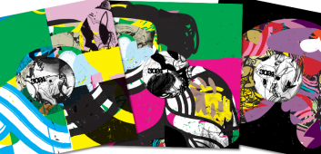
"Working intuitively, Erosie’s process involves moving between canvas and Photoshop while never straying too far from his interpretation of the music. Now up to release 018 – a Jon Convex/dBridge single that makes its visual debut here – there are no synaesthesia-like exchange values between the imagery and the timbre, tempo or melody. But the sound does determine the shape and structure of the artwork. How this works exactly, he remains unsure. In any case, he wouldn’t want to locate a precise formula. However, amongst the varied complex patterns, there is also continuity. Erosie reveals that he often bases a release’s artwork on the final layer of the previous one and there’s a nod here to the generic yet ultimately collectible label “housebag”. As per the packaging for Network Records releases from years back, a clear serial nature within a back-catalogue of otherwise disparate records has emerged."
"The collision aesthete designing the prettiest record sleeves in bass" Daniel Cookney. Dummy Mag, 10 April 2012 . Web.
21 September 2014.

"The analogue retroism of recent years, which may once have been a bulwark against the oncoming digital technocracy, is now buckling under the sheer pressure of the ease and ubiquity offered by the latter. It can no longer be fought through countercultural romanticism—not using the internet is as good as not breathing—and now artists are going with the flow, especially those who have no nostalgia for the older ways. When it comes to physical media, plenty of younger, emerging artists are somewhere between not having the means to produce or buy it, not being bothered to, and actively shunning the fetishism of music's objectified tokens. It takes up space, it costs a lot, it's a bit retro. Lots of people go further and don't even charge for downloads, their wares existing entirely as free-flowing files and code. Labels and artists like these are fringes of the furthest reaches of what could be called a professional music industry."
"The online underground" Adam Harper. Resident Advisor 22 September 2014 . Web.
25 September 2014.


